Help me out here, readers. Our other blog, Copenhagenize.com, is proud to be one of the sponsors of this year's Svajerløb - Danish Cargo Bike Championships 2010 on June 26, 2010 here in Copenhagen.
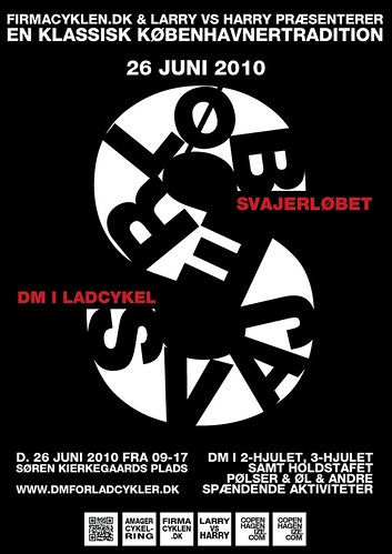
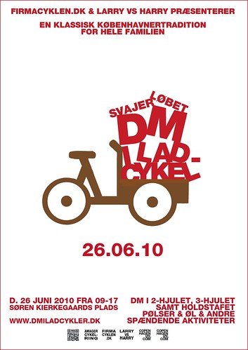
I've been whipping together some rough prototypes for posters and here they are. You're all a fantastic, creative bunch so tell me, which one do you like the best? There's a poll at the end of this post.
'Svajerløb' is the name of the century old cargo bike races in Copenhagen, raced by the original bike messengers (seven decades before that Kevin Bacon guy in Quicksilver), the Svajere or The Swayers. Called such because of the way they swaying way they rode their cargo bikes. They were damn sharp dressers, too.
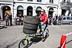
The races are for two-wheeled cargo bikes, three -wheeled and a team relay. You race around a track and then put a pile of car tires on the bike and tie them down before continuing.
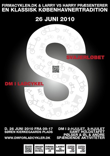
Anyway, just look at the designs and give me your gut feeling.
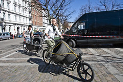
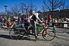
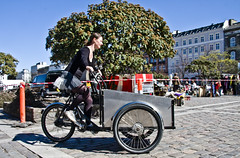
Thanks for taking the time to help us out. Here's some photos from last year's race:

They were sharp...the other blog is looking great. Well I voted, as usual in these matters, I am not with the group(s). Oh well.
ReplyDeleteciao
Hi, My comment is not specifically about this post. Just to let you know I had my own cycle chic moment, right here in Portugal, with a Danish girl.
ReplyDeleteWe went for a bike ride in the outskirts of Lisbon and I more or less warned her it would be an urban ride, and the best spots would require some mild off-road riding.
Because it had rained during the night, we had to go over some mud and water. When we got at the end of the day, her beautiful Burbery's mini-skirt and her Tommy shoes were as clean and tidy as in the beginning!!!
There is a fair bit of Weight in those Tyres,Tough going. I would love to have one of those Bulitt Bikes from Larry V Harry.
ReplyDeleteA Bicycle Courier Company has them in Dublin now.
I cast my Vote,it would not be Ethical to say which one I chose.
hey i'll be in CPH that day! hope to see the first poster hanging in every single wall of the city ;)
ReplyDeleteDet er synd hvis poster nr. 2 vinder for der er en fjel i websiden, det er ikke dmiladcykler.dk det er dmforladcykler.dk
ReplyDeleteI remember getting stuck on the flea market, when all of the sudden the race was on. Surreal, but funny. The second poster is hands down the easiest on the eye. It tells you what it is about even before you read the words. hi from Sandra
ReplyDeletei would love to see this in real life...
ReplyDeletealso would love to be fortunate enough to have a steed to commute with!
lovely.
i'm working on a poster for a similar event here in portland. that trike-full-of-type design is fabulous.
ReplyDeleteI love the coolness of #1 and #3, but love the concept of #2, but thought the colors especially the brown do not leap out. I love #2 but will love it more if it has black somewhere in it. Maybe the bike? Not a designer, but just giving the viewer gut feel...
ReplyDeleteAwesomeness on this blog, as always!